GARCIA
PORTFOLIO
Domino's Pizza Projects
Domino's Rewind Campaign
BRIEF
To celebrate the 20th anniversary of a Domino's franchise, the campaign centred around bringing back 2006 prices in 2026. The creative challenge was to develop a concept that reinforced this nostalgic offer while capturing the attention of the local community. To support the promotion, I created a visual identity inspired by time travel and rewinding the clock, using retro-inspired design elements to communicate the idea of stepping back in time and experiencing classic prices once again.
CHALLENGE
The biggest challenge was communicating the "2006 prices in 2026" concept in a way that was instantly understandable. The design needed to strike a balance between nostalgia and a modern Domino's brand identity, ensuring the time travel theme enhanced the promotion rather than distracting from it. The campaign also had to be flexible enough to work consistently across a wide range of print and digital marketing assets.
DOMINO'S REWIND
To bring the concept to life, I designed a bespoke Domino's Rewind logo inspired by the bold, retro styling of the mid-2000s, giving the campaign its own distinctive identity while remaining recognisably Domino's.


PROFILE
To expand the campaign identity, I further explored the concept of "rewind" by creating a secondary logo inspired by the classic television rewind symbol. This alternative mark reinforced the time travel theme while introducing a simple, instantly recognisable visual cue that could be used across supporting campaign assets. The secondary logo added flexibility to the identity system and helped strengthen the nostalgic feel throughout the campaign.


LOCAL ADVERT
As part of the campaign, I produced a promotional advert that took viewers on a journey back through time by showcasing Domino's advertising from different eras. The advert continuously rewound through the years until landing in 2006, revealing the return of 2006 prices in 2026. This storytelling approach helped build anticipation, clearly communicated the campaign message, and reinforced the nostalgic "rewind" theme in a memorable and engaging way.
SOCIAL MEDIA DELIVERABLES
Rather than simply promoting the offer, the social media campaign was designed to immerse audiences in the world of 2006. Each post explored a different cultural touchpoint from the era, drawing inspiration from brands and products such as MySpace, PlayStation, Sky TV, Nokia phones and CDs. This approach allowed the campaign to tell an ongoing story, giving each piece of content its own identity while collectively building anticipation for the launch.


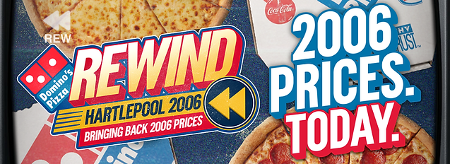
To strengthen the illusion of stepping back in time, I extended the television-inspired aesthetic across both print and motion assets. Vintage TV frames and on-screen interface elements were incorporated throughout the campaign, creating the impression that viewers were watching the content through a 2006 television. This subtle design device helped tie every touchpoint together while making the rewind concept feel more immersive and authentic.


OPENING DAY

To bring the campaign into the physical experience, the launch day featured a series of customer engagement activities inspired by the retro theme. Customers were invited to spin a prize wheel for the chance to win exclusive offers, while promotional vouchers were designed using the same nostalgic visual style as the wider campaign. Carrying the creative identity through to the in-store experience helped create a memorable launch day and ensured the campaign felt cohesive across every customer touchpoint.
RADIO AD
Easter Campaign
BRIEF
To design and develop a high-engagement, family-friendly digital experience for an Easter campaign aimed at driving customer acquisition and boosting seasonal sales.
CHALLENGE
The solution needed to cut through standard holiday promotional noise by balancing traditional, family-friendly seasonal aesthetics with a compelling gamified mechanic that incentivized user retention and converted interaction into direct sales.
SOLUTION:
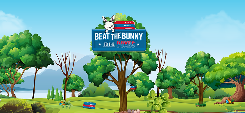
Instead of a generic holiday concept, we created a high-energy, pizza-themed Easter activation. I designed a single, cohesive visual identity that powered both the social media marketing and the rapid-fire mobile games, delivering the entire asset library to the development teams:
"BEAT THE BUNNY"
A fast-paced time trial where users had to frantically tap and open pizza boxes before the countdown timer ran out. I designed the interactive pizza boxes, countdown UI assets, and the competitive Easter Bunny mascot animations.
"EASTER FEASTER"
For the precision-feeding game, I designed the vector food graphics, progress trackers, and the central asset—a comical, step-by-step frame animation of the Easter Bunny getting progressively stuffed with pizza as the player taps.
THE CONVERSION
LOOP
By keeping the visual identity consistent from the initial social post to the final screen of the game, we removed the friction of traditional marketing. Completing the challenges unlocked tiered promotional deals, seamlessly turning high-energy social engagement into immediate sales.
Data Capturing
BRIEF
Responsible for creating high-converting marketing artwork, campaign identity systems, and UI asset libraries. My focus was developing visually engaging, evergreen design frameworks that drove customer data capture (emails/leads) while ensuring seamless, production-ready asset handoffs for the development and IT teams.
CHALLENGES
Combating "Form Fatigue." Customers instantly recognize standard data-capture forms and immediately tune them out. The core design challenge was keeping the campaign themes completely fresh year after year so users never thought, "Oh god, not another data capture."


SOLUTIONS
To aggressively break through consumer ad-blindness, I completely overhauled the user execution and visual theme for every single campaign round. Instead of showing a static email field upfront, I designed a rotating series of interactive, reward-first experiences—ranging from digital scratch-and-reveal concepts to tactile, product-focused touch mechanics and arcade-style mini-games:
Gamified Reward Loops: I shifted the user journey so the data entry field was only introduced after the user engaged with an on-screen interaction and unlocked a winning state, drastically increasing completion rates.
Diverse Visual Overhauls: Every campaign round featured entirely unique illustration styles, typography, and color schemes to ensure recurring users always felt they were participating in a brand-new, exclusive event.
Social Media Content Planning & Design

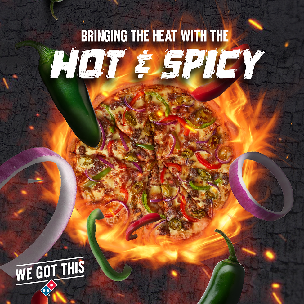


Earlier in my career, before stepping into the Head of Design role, I was on the front lines handling the daily creative grind for Domino’s franchise accounts. My main focus was pumping out a steady stream of fast turnaround social media graphics, motion assets, and content plans to keep local stores active and visible online. It was all about staying agile, constantly jumping on real-time internet trends and mixing in tactical promo deals without being spammy. Doing that high volume, daily production work under strict corporate guidelines really sharpened my speed and design instincts, giving me the exact hands-on foundation I needed to eventually step up and lead teams.


I have probably made thousands of these at this point.
Collection Perfection Window Wraps
BRIEF
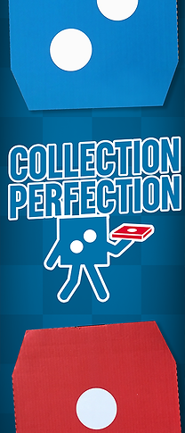
Designed large-format window wraps and POS graphics for Domino’s franchises to boost footfall and launch campaigns. For the "Collection Perfection" rollout, the layout was engineered around pricing psychology, scaling the typography significantly bolder as the price points dropped. This was paired with strategic directional arrow elements to instantly guide the consumer's gaze to key retail conversion zones while maintaining strict brand alignment.
CHALLENGES
Managing the creative rollout across nearly 100 franchise locations spanning the North East UK and Ireland presented a major production bottleneck. Because every single storefront featured unique architectural layouts and bespoke window dimensions, a one-size-fits-all asset approach was impossible. The core challenge lay in manually adapting, resizing, and versioning the complex master artwork for dozens of varied formats under a tight deadline, all while ensuring that the critical visual hierarchy and brand alignment remained flawless regardless of the scale or shape of the final print.


Animated In-Store Menus
BRIEF
Executed a complete motion graphics overhaul for digital in-store menu screens across multiple franchise locations in the North East. The project required restructuring the motion assets to display updated, localized product availability while strictly adhering to corporate brand guidelines. The final animations successfully modernized the store environments, ensured accurate menu compliance, and maintained fluid, eye-catching visual transitions across the digital estate.
Menu configurations were heavily fractured across the North East estate, with individual stores operating on entirely different inventory lists and regional product exclusions. The difficulty wasn't just swapping out text, but managing the visual blank space that occurred when a product was removed. I had to build a flexible grid system within the animations that could contract or expand depending on a store's specific stock. The hurdle was ensuring these menu adjustments didn't disrupt the alignment, rhythm, or strict brand compliance of the motion graphics when items were pulled from the screen.
CHALLENGES
Local Post Card Design
BRIEF
Designed a series of direct-mail postcards for a targeted residential campaign to re-engage local delivery zones and drive store recall. Adhering to the creative brief, I developed a nostalgia-driven, retro postcard theme using vintage typography and classic print styling. The final design balanced this retro aesthetic with modern brand identifiers, creating a distinct, tactile asset that cut through standard junk mail and reminded neighbors of their local store.


Halloween Social Creatives


Over the years, I designed a wide range of Halloween-themed social media artwork to drive engagement during one of the brand's biggest holiday periods. Working on these seasonal campaigns year after year allowed me to mix creative, spooky concepts with the official brand guidelines to keep the feeds fresh and relevant.
Whitby Store Opening
BRIEF
Over the years, I designed a wide range of Halloween-themed social media artwork to drive engagement during one of the brand's biggest holiday periods. Working on these seasonal campaigns year after year allowed me to mix creative, spooky concepts with the official brand guidelines to keep the feeds fresh and relevant.


CHALLENGES
Over the years, I designed a wide range of Halloween-themed social media artwork to drive engagement during one of the brand's biggest holiday periods. Working on these seasonal campaigns year after year allowed me to mix creative, spooky concepts with the official brand guidelines to keep the feeds fresh and relevant.
Christmas Social Artwork


Over the years, I designed a variety of Christmas-themed social media artwork to capture the holiday rush and drive festive engagement. Managing these seasonal campaigns year after year allowed me to blend festive, creative concepts with the official brand guidelines to keep the feeds looking fresh and celebratory during the brand's busiest time of the year.
Other Cool Sh*t


Just some other epic deliverables I've made that I can't put in one section:)